RED COLOUR: ORIGINS AND MEANING
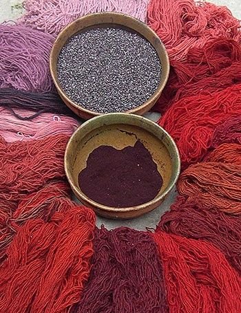
The colour red in medieval times was considered very valuable as it was relatively scarce. The inkwells of the period were able to reproduce a great variety of colours, however red was extremely difficult to treat in a durable way. As a result, red fabric was very expensive and it represented a sign of economic power. This tint was associated with the high society, so whoever dressed in red was a person of great power and who deserved respect.
THE COCHINEAL
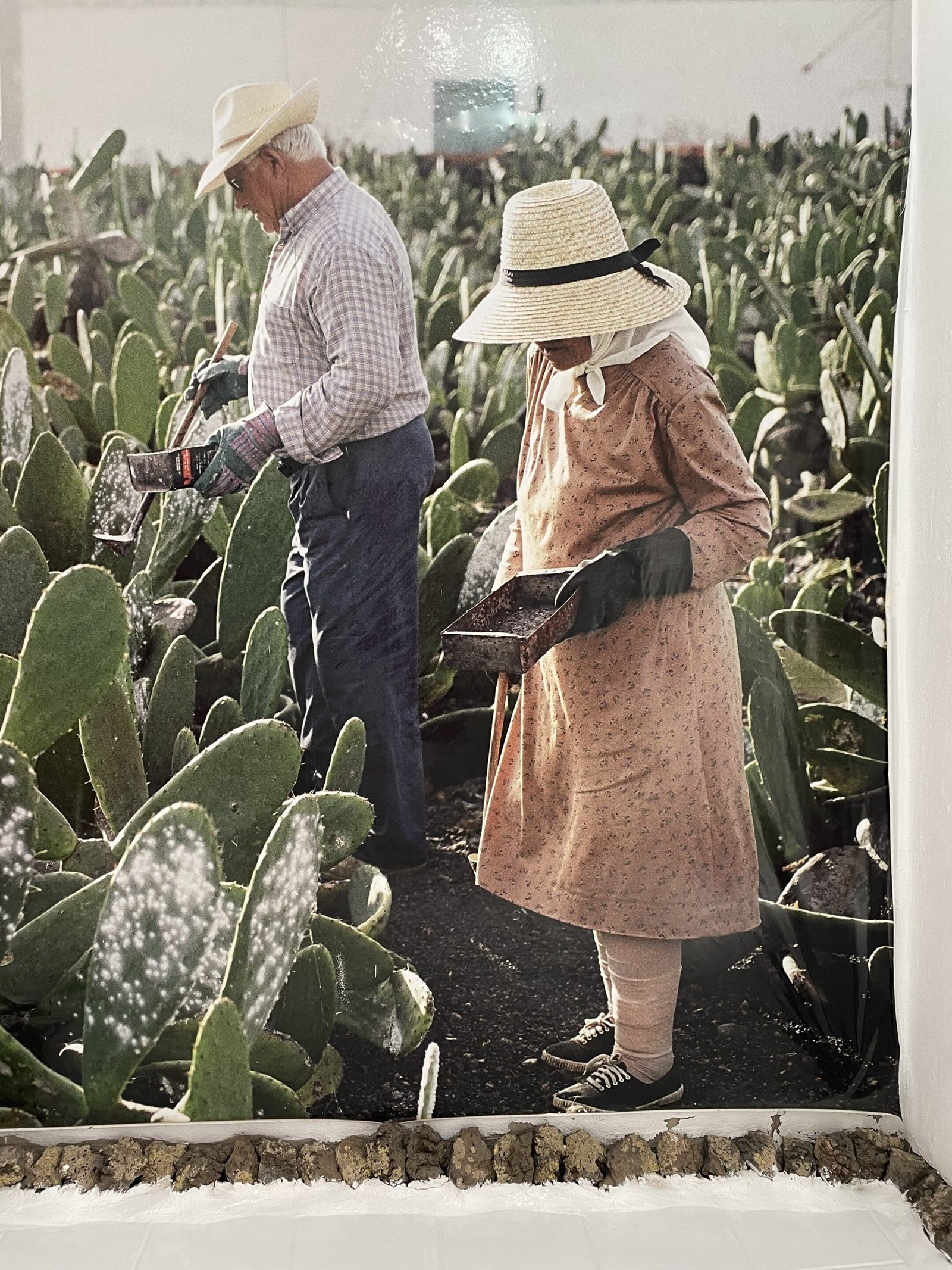
The value of this colouring was already known by the Aztecs prior to the discovery of America. When the Spanish conquered Mexico in 1521, they saw how the natives collected the cochineal from the cactus plants.
The discovery of America by the spanish crown opened a new world of riches unknown to Europe at that time. What is the cochineal? It’s a small insect which was abundant in certain types of cactus grown in Mexico.
This red pigment was used as textile colouring in South America prior to the Spanish conquers.
The first shipment of cochineal to Europe took place in 1523 and during centuries, together with gold and silver, was one of the most sought after materials of the American exportation.
Originally from Mexico and the Andean countries such as Columbia, Ecuador, Peru, Bolivia and Chile, it breeds in the stalks of the cactus, from where they feed on the sage extraction.
”LANZAROTE RED”
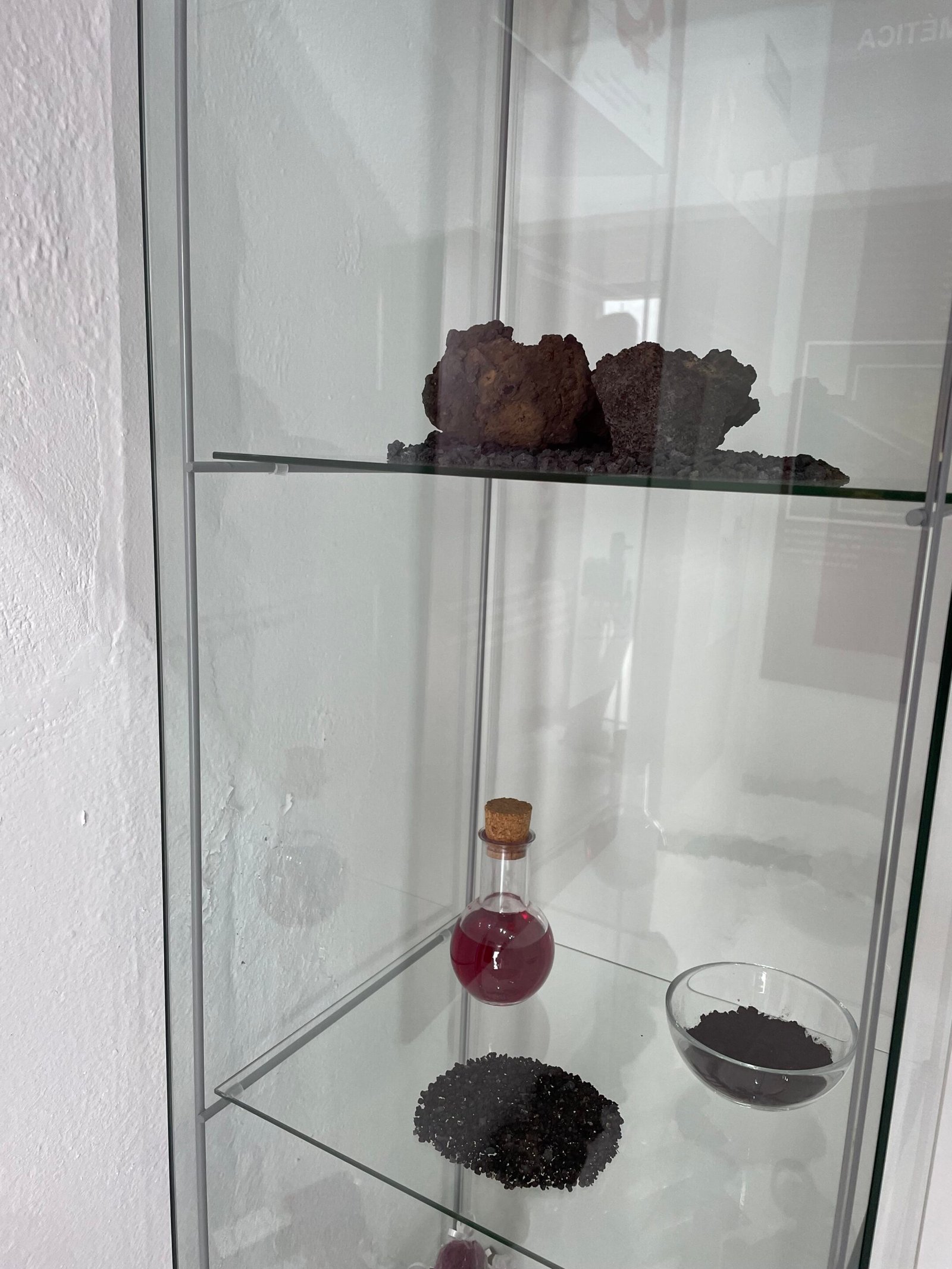
In Lanzarote, part of the canary islands, they derive from cochineal a shade called ”carmine”, which is one of the most appreciated, favourite and sensual colours in cosmetics today, following the new trend of organic products.
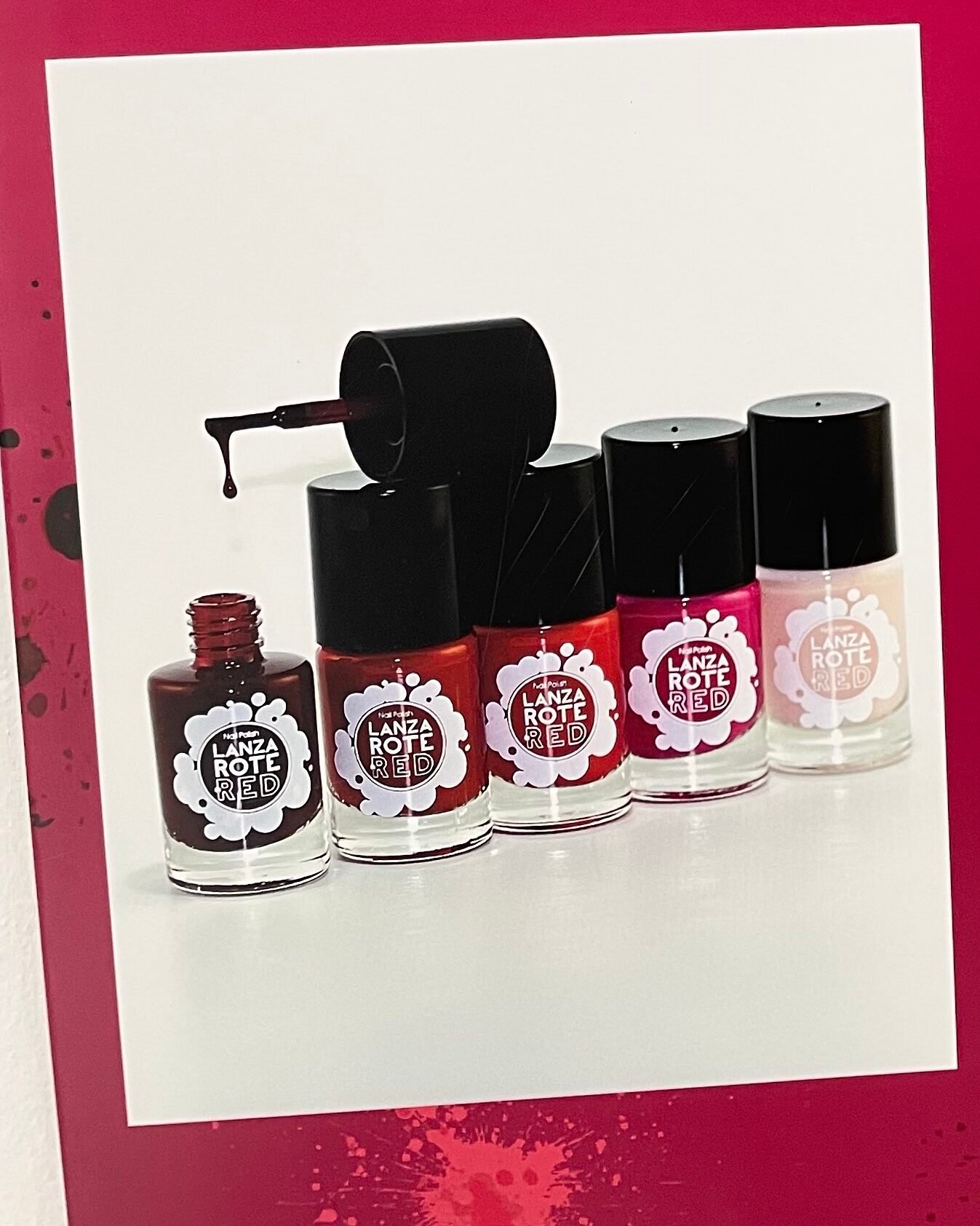
In one of the most important business in there ” Aloe Plus ”, they have created a colour cosmetic line called ” Lanzarote red ”, which is naturally fabricated using this insect as its base. A deep shade of red, in ”colour analysis” is mainly ideal for winter and autumn deep.
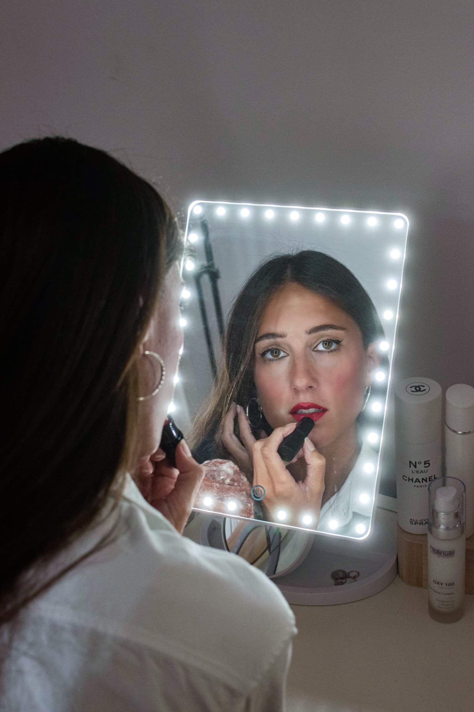
So in the cosmetic industry, pencils, face powders, lipsticks and many others are used. From a quality point of view, the cosmetic industry is the most demanding, as it only accepts the highest purity of carmine, which has to coincide in shade with its patterns and colours.
Secondly, this is the only colouring approved by the Food and Drug Administration ( FDA ) for its use and application around the eye area.
HOW DO THEY CULTIVATE COCHINEAL?
The landscape of the cochineal has been conserved in a significant way in the villages of Mala and Guatiza, located in the central – east area of Lanzarote. In this part of the island, the climate is desert hot and dry, with tempertures of around 20 degrees and scarce rainfalls.
In these climate conditions, the cactus plantations are capable of tolerating long periods of water shortages, as they are specially adapted to dry land.
Because of the size ( with hardly 250 harvesters ) and the volcanic origins, they only gather about 20.000 Kg, whereas Peru produces nowadays around 300.000 Kg of cochineal per year.
A NATURAL COLOURING FOR FOOD
Cochineal is used as a natural colouring in the food sector, to be more precise is defined as E-120. We also find it in vegetable conserves, marmalades, ice creams, meat products and milk products, such as in yogurts and fresh cheese, as well as in drinks, both alcoholic and non. It’s most probably the colouring with the best technological characteristics from among those natural. Its use is conditioned to its elevated price within the market.
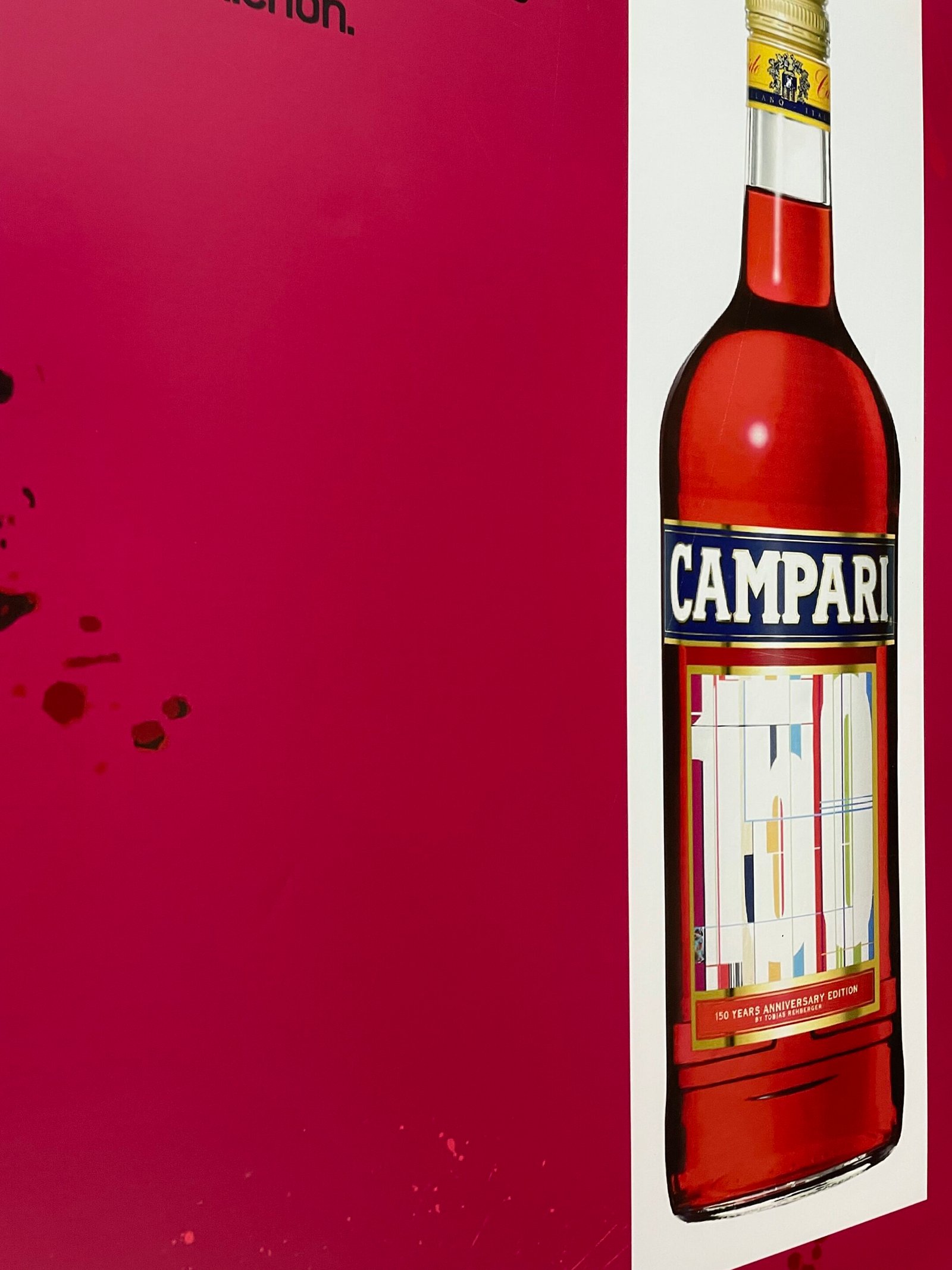
With the cochineal, colour is given to drinks such as Campari or Coca Cola, or to foods, such as salami.
RED IN CLOTHING AND INTERIOR DESIGN
When is the best occasion to wear red?
It’s a kind of colour which transmits strenght, sensuality, passion, luxury, creativity and vital energy.
The consequence is to use it during those days when you need dynamism and attitude.
Most importantly, try to avoid it during the interviews, as it tends to communicate aggressiveness and power.
In terms of interior design, use it in those rooms where you need energy and stimulation.
As a consequence, you should avoid it in those spaces where you want to create an atmosphere of relax and calm.
If this is the case, you may need a colour dedicated to the muscolar relaxation and to meditation, like the blue or the violet, as they transmit a sensation of extreme peace.


0 Comments